
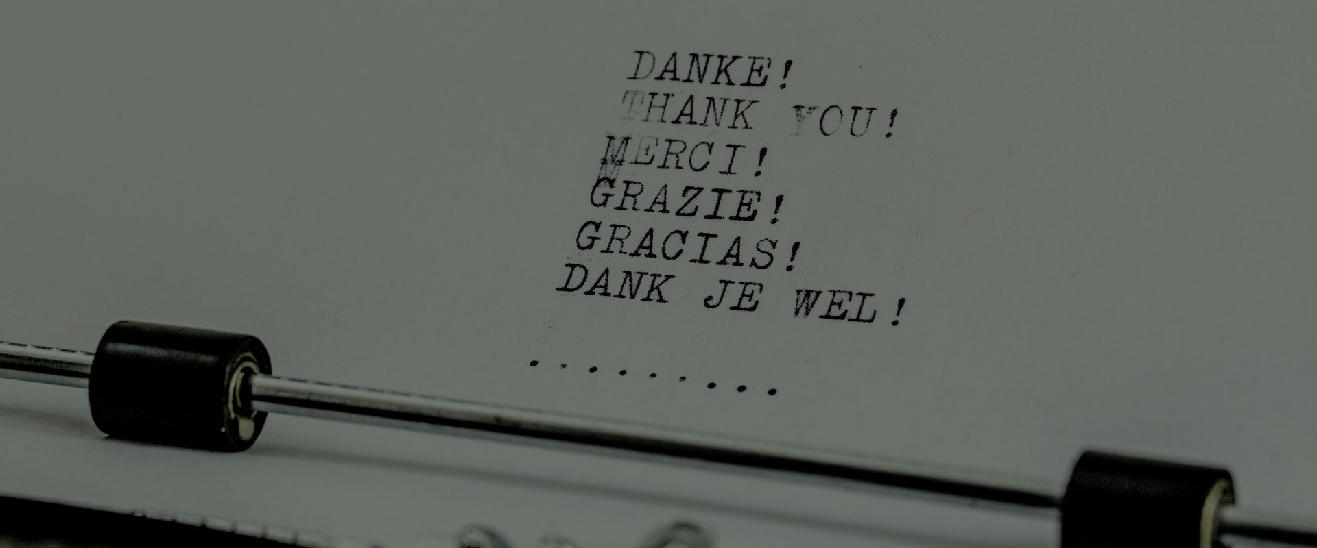
The Thank You App (TYA) is the nation’s first web-enabled technology that connects blood and plasma recipients with their donors while complying with medical privacy laws. Patients can anonymously send their donor a message of thanks and include a photo or video – all from their smartphone, tablet or computer.
To comply with my non-disclosure agreement, I have omitted and obfuscated confidential information
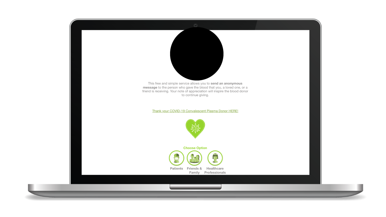
BEFORE
BACKGROUND
In 2017, tapping a button to send an anonymous message of thanks to your blood donor felt magical. By the end of 2020, this magic receded to a slew of disparate features that made the experience slow and complex to use.
I was part of an ambitious project to redesign the TYA appreciation experience for one of the largest non-profit blood collectors in the U.S.
CHALLENGE
In just 3 years, TYA transformed from a small messaging service in Oklahoma to a global messaging platform. By 2021, TYA delivered over 7 thousand messages worldwide and was being introduced nationwide as a part of the Presidential campaign, The Fight is in Us.
The original app — developed in 2017, struggled to scale alongside the hyper-growth of donations for Convalescent Plasma to treat COVID-19. Fundamental usability was challenged. Disparate features and experiments competed for focus. App reliability and performance issues increased exponentially.
The high level goals were to:
-
-
-
Make it fast and easy to use for everyone, everywhere.
-
Give recipients more control over crafting their message.
-
Create a platform for innovation and deeper engagement.
-
-
MY ROLE
I led the design of the new PWA appreciation experience and collaborated with three other developers on the features.
In addition, I worked alongside a research firm that conducted various focus groups and provided summarized results for analysis.
DISCOVERY
I was not surprised by the issues brought to light. The PWA was developed without an initial designer. As features were added to help the user, it seemed to become a more complex experience. It’s clear that users expected the experience to work with minimal effort.


